Void Space: Design Choices and Conflicts
Void Space didn't start as a technical project. It started as a question:
What does it look like to build a writing platform that prioritizes presence over engagement metrics?
Most products push toward engagement, more clicks, more time, more reactions. I wanted the opposite: a space that felt slow, quiet, and intentional. Something closer to a notebook than a feed. That single goal shaped every decision that followed.
The Core Conflict: Expression vs. Utility
I'm a developer. Naturally, I also want to write about:
- systems I build
- architecture decisions
- technical trade-offs
But personal writing and technical writing carry very different expectations. They change how a reader moves through a space, how they read, and what they're prepared to see next. A reflective essay followed by a technical deep dive isn't variety, it's a context switch. And context switches are expensive.
Separation Without Fragmentation
I didn't want multiple websites or brands. Fragmentation creates maintenance overhead and fractures identity.
Instead, Void Space treats context as a UX concern, not an infrastructure one.
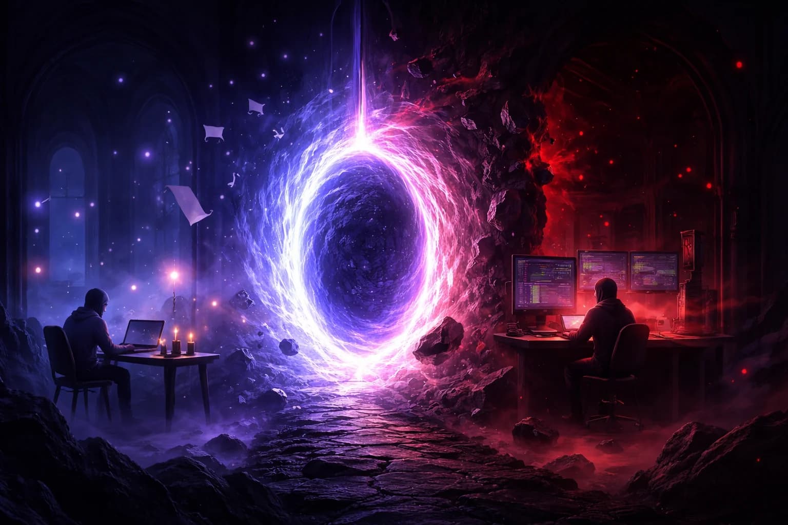
So now, the platform has two dimensions:
- Void Space: Personal, introspective writing. Muted colors, slower pacing, minimal affordances
- The Upside Down: Technical writing. Higher contrast, sharper typography, denser layouts
They share:
- the same codebase
- the same database
- the same infrastructure
But they do not share tone.
On the Surface, It's Just Another Route
From the outside, the split is unremarkable. You click a link, the URL changes, and you land on a different route. /blog becomes /upside-down. Different colors, different layout. Nothing unusual.
There's no hard boundary, no separate product, no sense that you've left the platform. Technically, you haven't, you're still in the same app, backed by the same system.
But the route change isn't the point. What matters is what that transition signals to the reader.
In most applications, routes exist to organize content. Here, they exist to establish mental context. The design shifts aren't there to show range or creativity. They're there to reduce friction when a reader moves between fundamentally different kinds of writing.
So the separation exists, not as a product feature, but as a design choice meant to respect the reader's attention.
There's no moment where the reader thinks about architecture or routing. They just feel that the space they're in matches what they're reading.
If that happens, the design has done its job.
Why Tone Is a Feature
Most blogs optimize for consistency: one design, one voice, one rhythm. That works when your content is narrow. Void Space isn't narrow. So instead of forcing everything into one aesthetic, it enforces coherence within a context.
Tone shows up in small ways:
- color temperature
- spacing density
- language used for actions
- how much the UI asks of the reader
These details determine whether a reader stays present or starts skimming.
Language as UX
One of the earliest decisions was to avoid borrowed social mechanics.
There are no "likes." Instead, there's "Resonates." (Functionally, it’s the same thing. Experientially, it's not.)
Void Space includes real-time features:
- anonymous short messages (“Void Whispers”)
- live presence indicators
Presence isn't framed as analytics or popularity. It's phrased as “souls wandering.” That framing changes how it feels to see the number move. It's informational, not performative.
The tech exists to support the feeling, not the other way around!
Friction Is Sometimes the Point
Void Space intentionally avoids:
- infinite scroll
- algorithmic ordering
- aggressive CTAs
- growth nudges
That's not because those patterns are bad, they're just optimized for a different goal. Here, friction acts as a filter. It slows interaction enough to make it deliberate.
In the end
Every design conflict I ran into—personal vs. technical, real-time vs. quiet, openness vs. moderation—forced a choice about what mattered more: efficiency or experience. I chose experience, even when it made things harder.
For developers, it's easy to think of UX as polish applied after the system works. Void Space was the opposite. The experience came first, and the architecture bent around it.
Good software doesn't always feel fast or clever. Sometimes it feels calm. Sometimes it gets out of the way. Sometimes it gives you just enough structure to think clearly.
Void Space is my attempt at that—and if nothing else, it's a reminder that we're allowed to build things that don't chase everything, as long as they know exactly what they're for. (All this with a costing: $0/month!)
// Comments